Minted, Data Visualization and d3
SATURDAY, DECEMBER 10, 2011As you may or may not know, I'm an intern at Minted. One question I often get asked my people is "What do you do at Minted?" Usually, I've tried to answer this question in a variety of ways, but it usually ends up in me trying to direct them to the website, or a very vague answer like "I do a little bit of everything" or "web development." This post describes one of my side projects while working there.
A few days ago, after a meeting, we ended the discussion on the separate topic of using data, and visual presentation on the site. Getting back to my desk, I decide to play around with a few things, in the spirit of the meeting. Finally, I remember a library called d3.js, introduced to by a friend (let's call him Chris). d3 is really neat in that you can feed it in data to create a visualation, generating a bunch of DOM elements (or SVG). The elements can be dynamicly classed, and it will display differently (due to differences in styling). d3 also provides functionality to transform and animate the visualization.
The Idea
Looking at the d3 examples, the first thing that struck me was the heatmap visualization, showing unemployment rates across the US, by county. I knew we kept track of zip codes for shipping, and thus, an idea was born. Querying for zipcode and order data was pretty simple, but since I was piggybacking onto this d3 example, I wanted it in json format. Some hacking and string replacing later, I had my dataset.
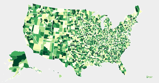
 First attempt
"That was simple, putting this together only took 20 minutes!" I excitedly emailed this out to the team.
Being a Canadian, my knowledge of US geography is fairly limited. So I didn't think it would be strange at all that the highest concentration of orders would be in Alaska and Montana. Eventually I realized that something was wrong, but why? It turns out counties also have 5 digit number codes. Counties Codes and Zip Codes are both 5 digits! Counties are identified using something called a FIPS county code, and of course, with there being ~50000 zip codes and ~1400 counties, there was bound to be some overlap. The next step was to translate from zip codes to county codes, or vice versa. A quick google search resulted in nothing promising, but I found this site. It allowed me to enter in a FIPS code and would give a table with zip codes in that county. I decided that I would try to data mine the site. The code went something like this: After a couple hundred requests, my ip was blacklisted for the day, so I needed some other plan. After searching for a long while, I came across this site, run by the Center for Disease Control and Prevention, a government organiztion. This page had the data I needed, but it came in at about 1.3GB (unzipped). This came in 10 text files of about 130MB each. The data was formatted like this:
The zip code is the first 5 digits. The county fips code is the 2 digit state code, followed by the next 3 digits. Of course, there's another map going from state letter codes to FIPS codes. The code to process all of this text is below: The resulting map ends up being about 500kb of text, which I will try to put up somewhere, in case someone else needs it. EDIT: here Adding in the county code to zip code map allowed me to finally get an accurate heat map. Accurate in that all of the data was being correctly used, but the formula for calculating the level of "heat" was not tuned. This took away a lot of the depth that the map could have shown. I was still using the default function, with a slight modification for my county map, which had this logic: The heatmap was styled so that there are 9 levels, classed from "q0-9" to "q8-9" with 0 being the lighest and 8 being the darkest. Since this was originally done with unemployment rate precentages, this was not suitable for my needs. With this basic formula, any county with over 12 orders would be shown with the highest level. Another problem was that it did not differentiate between 0 and 1 orders. Showing any county with at least 1 sale felt very important. Some of the options I tried are shown below, listed in order. This was an interative process to get something that I felt displayed a sufficient amount of data. My first solution resulted in a more balanced map, but still did not differentiate between 0 and 1 order. This was solved by the 2nd solution. The third solution was more tuning. The final solution, where the data is entered into a list, allowed for the most control, allowing me to tune it as I wanted, instead of relying on a forumla. After putting this all together, it took a couple more hours to hook this up into a usuable web page on the site, instead of a random page on my local machine being force fed a bunch of data files. SVG is surprisingly powerful, having used for several web applications now. Finally, this post got kind of long and took a surprisingly long time, but hopefully this offers some insight into what I'm doing. Minted is hiring. EDIT: Due to popular demand (of one person), I've posted a FIPS to ZIP code map here.The Snag
Method 1
1
2
3
4
5
6
7
8
map = {}
for code in fips_list:
  url = "http://www.melissadata.com/lookups/CountyZip.asp?fips=" + code
  r = urllib2.urlopen(url)
  html = r.read()
  zips = re.finall('something complicated', html)
  map[code] = zips
print map
Method 2
1
2
3
11789000231000125432543NY103SUFFOLK
11789000231000225442544NY103SUFFOLK
11789000231000325452545NY103SUFFOLK
1
2
3
4
5
6
7
8
9
10
11
12
13
14
15
16
17
18
19
20
21
22
23
24
25
26
27
28
29
30
31
32
33
34
35
36
37
38
# Not all states shown here
state_map = {
  "AK":"02",
  "AL":"01",
  "WY":"56"
}

text = sys.stdin.read()
lines = text.split("\n")
result = {}

for line in lines:
  line = line.strip()
  if len(line) == 0:
    continue

  # Extract data from the line
  zipcode = line[0:5]
  state = line[23:25]
  code = line[25:28]

  key = ''
  # Ignore bad state codes
  if state in state_map:
    key = str(state_map[state]) + str(code)
  else:
    continue

  if key in result:
    result[key].add(zipcode)
  else:
    result[key] = set()
    result[key].add(zipcode)

# For printing in a JS friendly way
for key, value in result.iteritems():
  result[key] = list(value)
print result
The Visualization
1
2
3
4
function quantize(d) {
  var orders = data[countyMap[d.id]];
  return "q" + Math.min(8, ~~(orders * 9 / 12)) + "-9";
}
function quantize(d) {
  var orders = data[countyMap[d.id]];
  return "q" + (orders / 50) + "-9";
}

function quantize(d) {
  var orders = data[countyMap[d.id]];
  return "q" + Math.min(8, orders / 50 + 1) + "-9";
}

function quantize(d) {
  var orders = data[countyMap[d.id]];
  return "q" + Math.min(8, orders / 30 + 1) + "-9";
}

function quantize(d) {
  var orders = data[countyMap[d.id]];
  var heatLevels = [...];
  for (var i = 0; i < heatLevels.length; i++) {
    if (orders > heatLevels) {
      return "q" + i + "-9";
    }
  }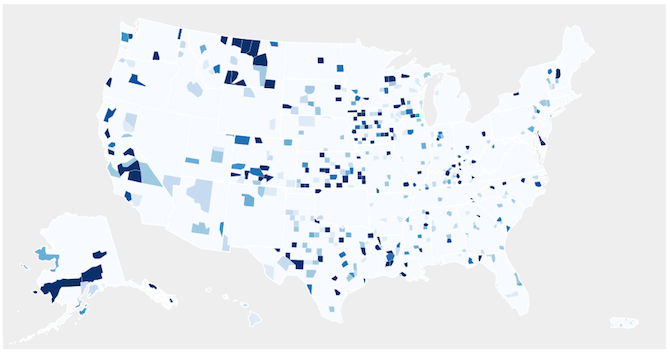
}The Result
 Final Order Heatmap Visualization
Random Thoughts and Remarks